AI Design Slop Can Fail Your Build Now
The anti-slop skill everyone installs ships a detector CLI: 59 deterministic rules, no model, no API key, exit 0 clean and exit 2 on findings. That belongs in CI — and the zip-export handoff everyone films is the lossy path.
This is a real site. It is not broken. It fails 142 checks.
Before any argument about tooling, look at the thing itself. This is voho.ai as it stands today — a live product site, dark, tidy, professionally made. Nobody would call it a mess.
Now point the detector at it. No model, no API key, no opinion — 59 deterministic rules reading what the browser actually rendered:
$ npx impeccable detect https://voho.ai/
142 anti-patterns found.
$ echo $?
2
A hundred and forty-two, and a failing exit code, on a site that looks perfectly good. That gap — between looks fine and fails — is the whole subject.
Snapshot: 10 August 2026, detector CLI 3.5.0. Both numbers above came from running the command, not from a docs page. Every other figure here is read off the project's own site, repository and issue tracker, all linked at the end.
Ninety of them are not about taste at all.
The temptation is to assume a number that large means the design is bad. It does not. Here is the whole breakdown, unedited:
undersized-ui-text— 49. Labels and metadata set too small to read comfortably.low-contrast— 41. Text that does not meet the contrast ratio it needs against what is behind it.icon-tile-stack— 15. Rows of identical icon-and-label tiles.kicker-above-heading— 12. The small tracked label sitting above a heading.line-length— 7. Paragraphs running wider than is comfortable to read.gradient-text— 6. Headline type filled with a gradient.numbered-section-labels— 4,dark-glow— 4,nested-cards— 2,skipped-heading— 1.
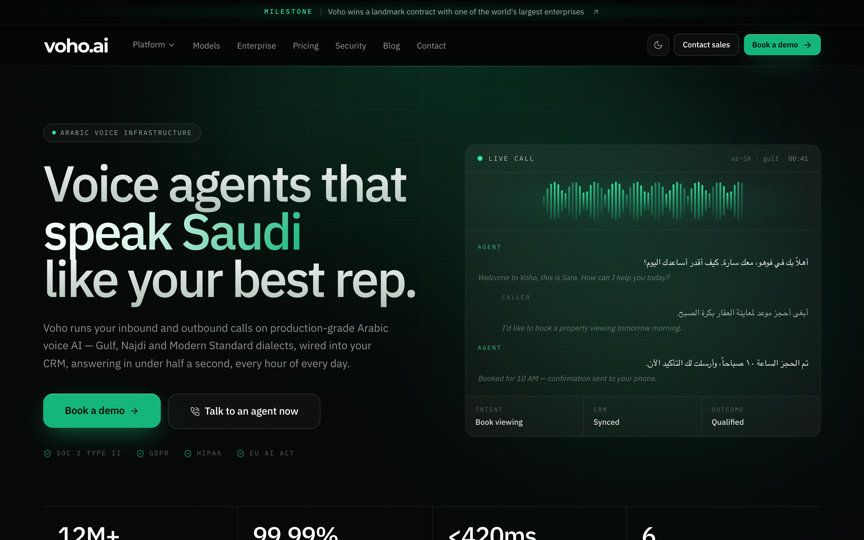
Ninety of the 142 are undersized-ui-text and low-contrast. Those are not style opinions. They are legibility, and they are invisible to whoever built the site — because they built it on a good monitor, in a dark room, knowing already what every label says.
So we fixed those ninety, in the real repository, and ran it again.
$ npx impeccable detect http://localhost:3111/
64 anti-patterns found.
$ echo $?
2
142 to 64. undersized-ui-text went from 49 to zero; low-contrast from 41 to 12. And here is the part worth the video — it took two changes.
- One colour. A single token,
--vh-text-faint, was#62736c. Against the three dark surfaces it sits on that is 3.84:1, 3.99:1 and 4.06:1 — against a requirement of 4.5. A near miss on every one of them, which is exactly why nobody caught it. Moved to#73877f, same hue, one step lighter: 5.05:1 at worst. That fixed twenty-nine findings. - One size. Every
text-[10px],text-[9.5px]andtext-[8.5px]raised totext-[11px]— a size the design system already used in fifteen other places, so nothing new was invented. That fixed forty-nine.
Nothing was redesigned. The screenshot above and the one after look like the same site, because they are — the labels are simply readable now.
The remaining fifty-two are the taste half: gradient text, kickers, icon tiles, glow. Those are arguable, and some of them are deliberate brand decisions. The point of separating them is that you can fix ninety without having a single conversation about design.
These tools do not give an agent taste. They give it a vocabulary and a linter.
Every walkthrough of this category is framed as taste injection: install the skill, and the model stops producing generic work. That framing is why so many people install one of these, feel almost nothing change, and quietly stop using it.
The project is blunter about this than its fans are. The headline on its own site is "The missing design vocabulary for agents" — vocabulary, not taste.
Here is what is actually in the box, and the two halves are not alike.
- A shared vocabulary. Twenty-three commands —
polish,quieter,bolder,typeset,distill,harden,overdrive— each with a defined meaning on both ends of the conversation. "Make it quieter" stops being a mood you hope the model shares and becomes an instruction with a specification behind it. Genuinely useful, and not taste. It is a dictionary. - A detector. Fifty-nine rules that fire or do not fire, with no model in the loop. Measurable, gateable, and almost never filmed — because a passing lint run is the least photogenic thing in software.
Nothing in either half decides what your product should feel like. That was always going to be yours, and the honest version of this pitch says so out loud.
The stack has a top, a middle and a bottom. Only the bottom one is machine-checkable.
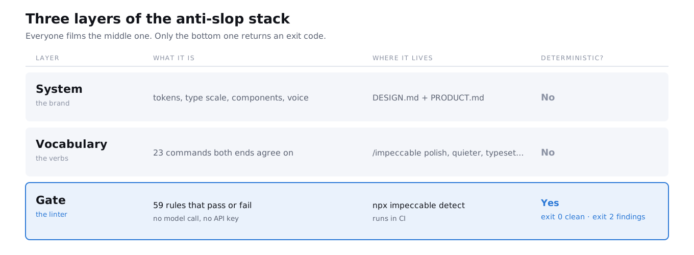
Read it bottom-up and the strategy falls out. If you cannot write down your type scale, no skill is your problem — you are missing the top layer. If you can, but every generated page still drifts, you are missing the gate.
The durable asset is a markdown file, not the tool that wrote it.
First run is /impeccable init. It interviews you and writes two files: PRODUCT.md, always, and DESIGN.md, offered. Between them they record audience, product lane, voice, anti-references, colours, typography and components. Every later command reads them.
The word worth stopping on is anti-references. Not "here is what we like" — the list of things that are near enough to be tempting and are wrong for you. That is the field with the most signal in it, and it is the one people leave blank.
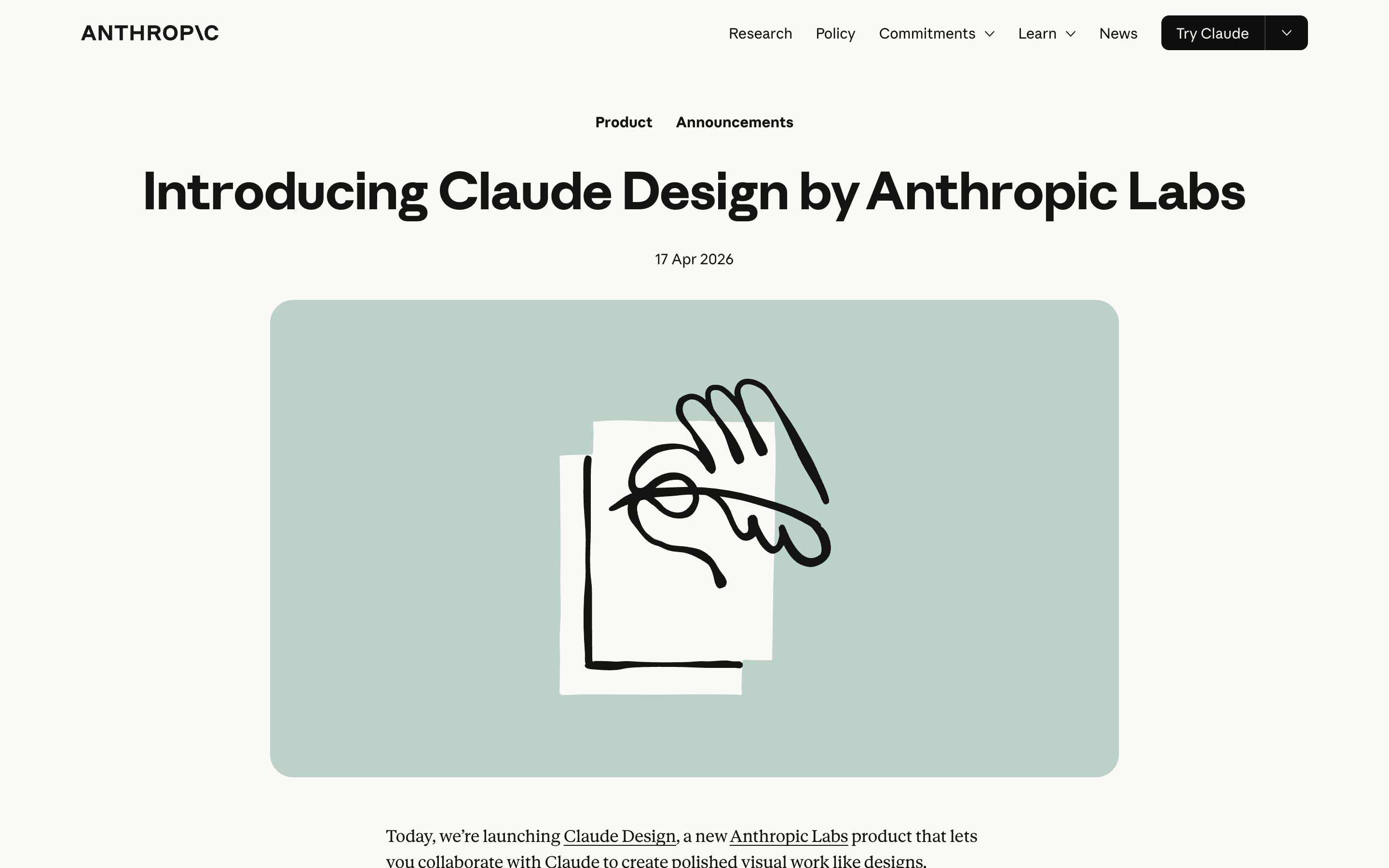
Anthropic's own product does the same thing from the other direction. Claude Design, launched 17 April 2026 and included with Pro, Max, Team and Enterprise, builds a design system by reading your codebase and design files, then holds every later project against it. Different surface, same idea: decide once, in a file, and stop re-deciding per prompt.
Which one you use matters far less than whether the file exists. A skill that reads no design context is a very expensive way to get an average opinion.
Commands are useful because both ends agree what they mean.
The set covers a whole working process rather than one aesthetic:
- Plan —
shape,craft,init - Judge —
critique,audit,document,extract - Adjust —
bolder,quieter,distill,colorize,typeset,layout - Finish —
polish,harden,onboard,clarify,adapt,optimize - Push —
animate,delight,overdrive,live
That bolder and quieter both exist is the tell that this is a vocabulary rather than a style. A one-trick generator has no quieter. It only knows how to add.
live is the one that gets filmed: it serves the project on localhost:4321, you pick an element in the browser, and it returns three variants you can accept straight into source. It is a good loop for micro-decisions. It is also the layer that changes nothing structurally — you are still the one choosing.
The detector is a linter, and a linter's whole value is that it is boring.
This is the piece the category skips, so here it is in full. It scans a directory, a file, or a live URL:
$ npx impeccable detect src/
$ npx impeccable detect index.html
$ npx impeccable detect https://example.com
$ npx impeccable detect --json .
Six categories of rule: contrast, typography drift, layout overflow, AI-design patterns, motion brittleness, and design-system violations. Note what that list is and is not. Five of the six are quality defects that were always defects. Only one of them is about slop.
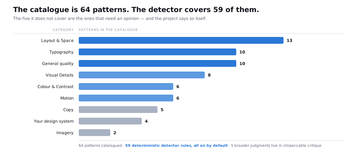
And here is the number that actually matters, which the project publishes and nobody repeats. The catalogue is 64 patterns. The detector covers 59 of them. The remaining five are broader judgments that live in /impeccable critique — because they need a model to have an opinion.
You can narrow it — --scope type, --scope layout — and you can tell it to ignore what it should not be judging:
$ npx impeccable ignores add-value overused-font Inter --reason "Brand font"
$ npx impeccable ignores add-file "src/legacy/**"
That first command is the most important one on this page, and it is an admission built into the tool: sometimes the flagged thing is deliberate, and a detector you are not allowed to argue with is a detector that is designing for you.
The reason this matters more than any of the pretty parts: it runs with no model and no key, so it is fast enough and cheap enough to sit in a hook or a pipeline. Fail the job on 2. Then the conversation about whether a violet gradient is fine happens once, in a config file, instead of in every pull request forever.
The harder test: a page written by someone who read the rules.
Running it on a live site you did not write is the easy version, and we opened with it. The harder question is whether a rule pass still finds anything on a page built by someone who has just read all fifty-nine rules and is actively trying to avoid them.
So we pointed it at the demo page attached to this resource — a page hand-written by someone who had just read all 59 rules, with a column of deliberately good examples in it. First run:
$ npx impeccable detect gallery/
47 anti-patterns found.
$ echo $?
2
Two of those were in the good column. An infinite loading sweep in the panel demonstrating motion brittleness. Body text at 3.0:1 in the panel demonstrating contrast. Both written by someone actively trying not to make those mistakes, on that exact subject, that afternoon.
After fixing what was genuinely wrong and leaving the deliberate specimens alone: three findings, all three of them the ones the page exists to demonstrate. That is what a working gate looks like — it goes quiet everywhere except where you meant it.
Then read the JSON. --json exists so something other than you can consume it, which is the entire point.
Export a zip, drag it in, ask the agent to "familiarise itself" — that is the fallback, not the path.
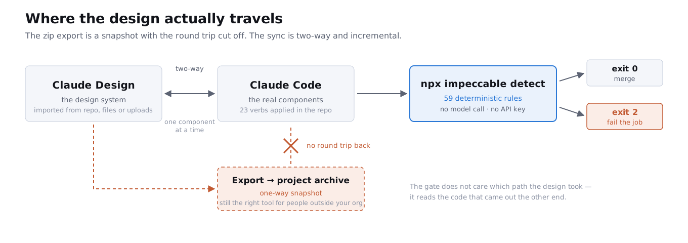
Claude Design will export — internal URL, folder, Canva, PDF, PPTX, standalone HTML. Those exports are real and they are the right tool for handing work to someone outside your organisation.
They are not the developer handoff. The design-to-code path is a two-way sync between a design-system project and your local component library, and its defining property is that it goes incrementally, one component at a time, explicitly never as a wholesale replace. That constraint is the feature: a design system is not a thing you overwrite, it is a thing you reconcile.
A zip cannot do that. It is a snapshot with the return journey removed — so the moment you implement anything in code, the canvas is wrong and stays wrong. If your workflow is "export, drag, re-explain," you are paying that cost every iteration.
A generator is a supplier. It is not a design system.
The other half ofreel is asset generation — wiring an image and video model in so the agent can produce logos, textures and hero art without leaving the terminal. Higgsfield is the one most commonly used for this, and worth knowing: there is an MCP connector for the Claude apps and a separate CLI which is the route intended for terminal agents.
The same goes for the component galleries. All three are good, and all three are being scrolled by everyone else reading the same advice:
- 21st.dev — sortable by most downloaded, which is also a ranking of what everyone else has already shipped.
- Aceternity — the shader and distortion effects you have seen on a hundred landing pages this year.
- React Bits — newer, sparser, and therefore currently the least recognisable of the three.
Order of operations decides whether any of it helps. A generator fills slots that the system already defined — it does not define them. Generate first and you get a folder of beautiful assets that agree with nothing, which is a more expensive kind of slop.
Fifty-seven thousand installs means a lot of people avoiding the same 59 things.
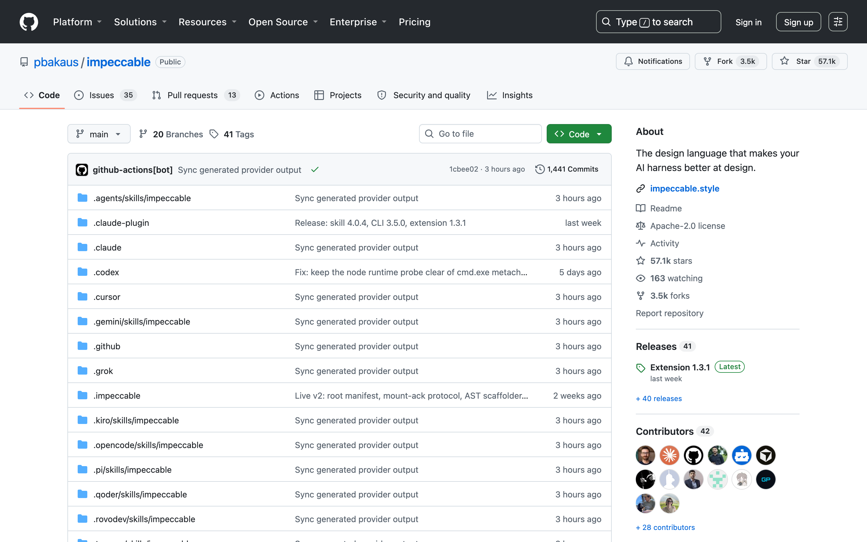
The repository is sitting at 57.1k stars, Apache 2.0, 3.5k forks, and it installs into fourteen different harnesses. That is not a niche skill. That is a substantial share of everyone currently generating front-end code, running the same rule set.
Which produces the obvious problem. If enough people suppress the same 59 tells, the absence of those tells becomes the new tell. Anti-slop at scale is a house style, and a house style everyone shares is where slop came from in the first place.
The project clearly knows this — the "worlds" idea on its own site, a deck of pre-reviewed graphic systems dealt as challengers against the model's first instinct, is a hedge against exactly this convergence. The site claims 177 of them. That number is on the marketing page rather than in the docs, so attribute it to them rather than to yourself.
The practical version: treat the 59 rules as defaults you are supposed to disagree with in a few specific places, and put those disagreements in the ignore list where they are written down. A team whose ignore file is empty has not made a single design decision yet.
Two of them are about trusting a green run you did not earn.
- A gate that cannot go red is worse than no gate. This is not hypothetical here. Issue #266 reported that an unrecognised subcommand fell through to the detector, printed
Warning: cannot access <word>, and exited 0 — sonpx impeccable instalread as a clean run to any pipeline. It is closed and fixed. The habit it should leave you with is not: assert on a known-bad fixture when you wire this up, and watch it fail once on purpose. Every silent lint gate in history was green. - There is no such thing as "the version." There are three, released together, and the repository's own release commit spells it out: skill 4.0.4, CLI 3.5.0, extension 1.3.1. So "version 4" means the skill. The thing you put in CI is the CLI, and it is on 3.x. Quoting one number for all three is how people end up debugging the wrong changelog.
- It reads HTML and CSS, and only HTML and CSS. The docs are explicit: "the engine reads HTML and CSS, so it has nothing to say about a native iOS or Android codebase." If
PRODUCT.mddeclaresios,androidoradaptive, the native pass is/impeccable audit— VoiceOver, TalkBack, touch targets — and that is a different command with a different guarantee.
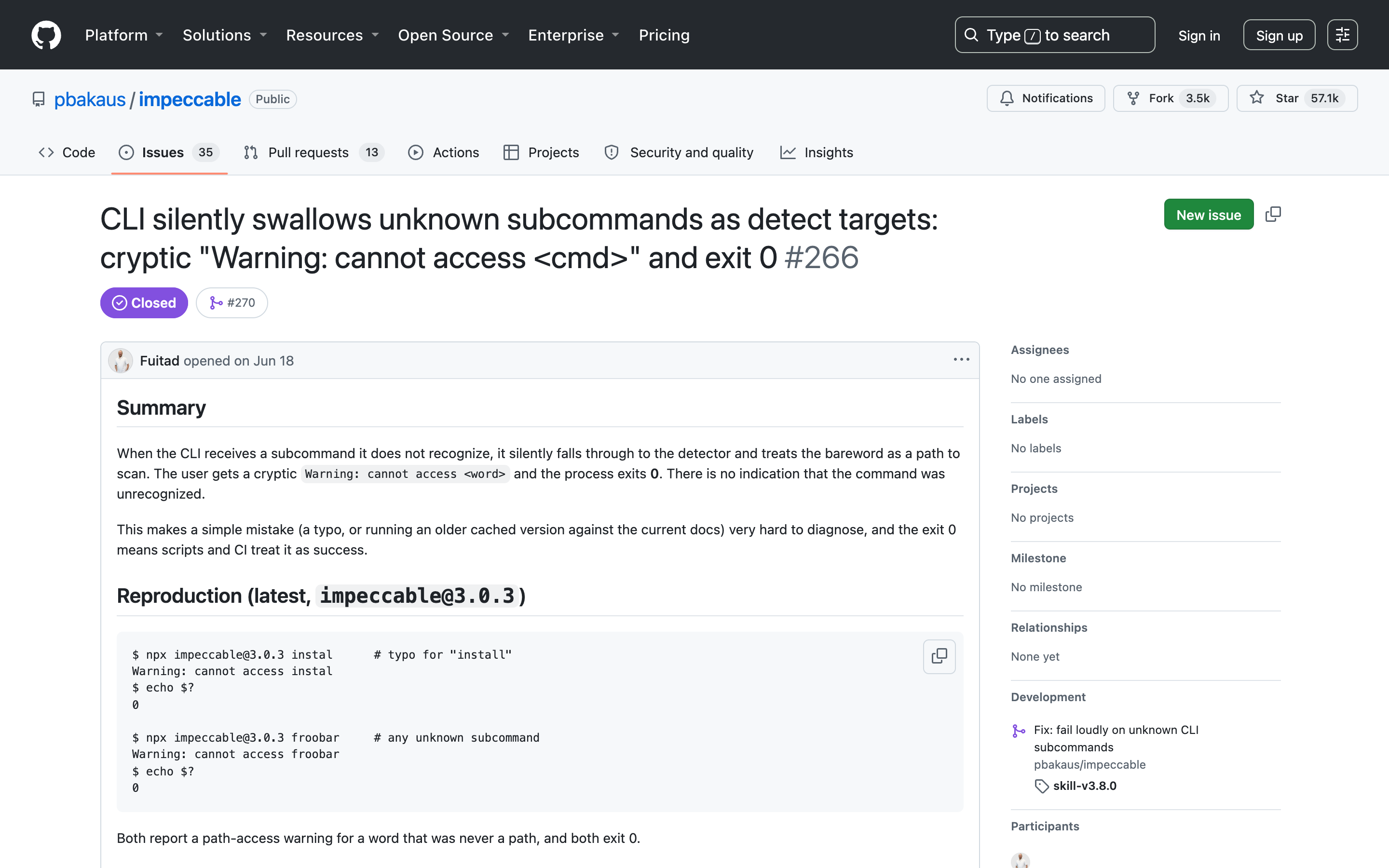
Credit where due: --quiet for CI and pre-commit was requested in June and shipped. Both of the sharp edges worth writing about were filed by users and closed by the project inside a couple of months, which tells you something more useful about whether to depend on this than any star count does.
Diagnose the layer before you install anything.
You cannot name your type scale, your accent colour or your anti-references. You are missing the system. Write DESIGN.md — by hand, by interview, or by importing a design system. A skill layered over no opinion returns an average one.
You have the system, and you keep typing paragraphs of correction at the agent. You are missing the vocabulary. Install the skill for the 23 commands, and expect the gain to be speed and consistency rather than beauty.
You have both, and generated pages still drift over weeks. You are missing the gate. Wire npx impeccable detect into CI, fail on 2, and stop relying on remembering.
Your deliverables are decks, one-pagers and client work rather than a repository. Claude Design, and skip the CLI entirely — a linter that reads code has nothing to say about a PDF.
And the case for doing none of it: if you ship one page a month and you review it yourself, a lint gate is ceremony. The gate pays for itself on repetition and on other people's commits.
Automate the half that has rules. Keep the half that does not.
The tells are mechanical. Contrast ratios, type scales, overflow behaviour, motion that ignores a system preference, four greens where there should be one token — every one of those is checkable, and being checkable it should be checked by something that never gets tired or generous at 6pm on a Friday.
What is left after that is the part worth your attention: what this thing is, who it is for, and what it should feel like to use. No skill has an opinion about that, and every video promising one is selling the easy half.
Put the check in the pipeline. Then go argue about taste with the time it gives you back.
Everything above, traceable to a primary source.
- impeccable.style Impeccable — Design skills for AI harnesses (official site)
- impeccable.style Impeccable — Detector CLI reference (exit codes, flags, scopes)
- impeccable.style Impeccable — Slop: the 64-pattern catalogue, and the 59/5 split
- github.com GitHub — pbakaus/impeccable
- npmjs.com npm — impeccable
- github.com Impeccable issue #238 — Add --quiet flag to impeccable detect for CI / pre-commit use
- github.com Impeccable issue #266 — CLI silently swallows unknown subcommands as detect targets, exit 0
- anthropic.com Anthropic — Introducing Claude Design by Anthropic Labs
- higgsfield.ai Higgsfield — MCP server
- higgsfield.ai Higgsfield — CLI (the route for terminal agents)
- 21st.dev 21st.dev — component gallery
- ui.aceternity.com Aceternity UI — component gallery
- reactbits.dev React Bits — component gallery
- venturebeat.com VentureBeat — Anthropic ships major Claude Design overhaul: design system imports, code round-trips
- claudecodexmastery.space Impeccable — the site, scrolled (25s)
- claudecodexmastery.space Impeccable — the 64-pattern slop catalogue, scrolled (20s)